

Global Temperatures Spiral Out Of Control In New Climate Change Animation
It has never been easier to see how climate change is spiralling out of control.
It is practically a maelstrom of danger to observe a winding coil of global temperatures spanning from 1880 to 2021.
Climate scientist Ed Hawkins, who developed the original climate stripes, designed the animation based on NASA's GISS Surface Temperature Analysis.
Professor Hawkins aims to organize climate data in ways that can be easily interpreted and remembered by the public.
His first 'climate spiral' went viral in 2016. An animated representation of our current climate crisis was beautifully simple and frighteningly stark. In fact, it was used in the opening ceremony of the Olympics in Rio.
Having been absent for five years, the spiral has returned with a wider mouth than ever before.
Each month of the year is represented by a revolving line displaying global surface temperature information.
When the years accumulate, the line of data becomes like a slinky. In the mid-nineteenth century, however, the line begins to spread outward, creating a tornado-like effect.
By the turn of the century, the belt is pushing outwards with alarming velocity. Between 2016 and 2021, it crosses the yellow boundary that represents one degree of warming several times.
In July of 2021, the Northern Hemisphere experienced the world's hottest month ever recorded. You can see it at roughly six o'clock on the climate spiral.
The recording is unprecedented for now, but it will no doubt have company soon enough. The last nine years are all among the hottest 10 on record. Not even a global pandemic seems to slow our trajectory down.
Turned on its side, the whirlpool of data looks ready to swallow the future right up.
The spiral can be found online at NASA's Scientific Visualization Studio.
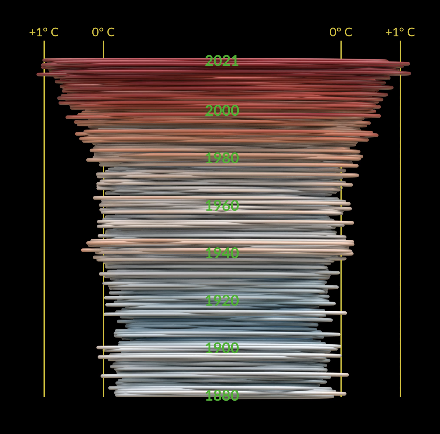
Here's the same data shown as a vertical graph.


