
Maps Are Pure BS, Here's The Truth.
Russia isn't gigantic.
Neither is North America.
In fact, the Northern Hemisphere is way smaller than maps we see historically.
But why are they so damn inaccurate?
That's a two-part answer...
- The maps we're used to seeing are called Mercator Projections and are meant for a cylindrical plane. Not an oblate spheroid (or roundish) Earth.
- Named after the cartographer Gerardus Mercator in 1569, the Mercator Projection shows relative placement of our countries and continents. But not accurate depth.
Check it out in this video:
You'll realise that there is pretty much no way to view the world in a 2D plane because of depth.
Globes, on the other hand, can show the curvature of the Earth with this third dimension.
With the Mercator Projection, the further you get from the equator, the less accurate the maps relative country size is.
Because we are losing the effect of the Earth's curvature as the Northern and Southern Hemisphere's are further away.
This is why Russia appears HUGE and Greenland is about 10 times its actual size. On a Mercator Projection, it appears almost the size of Africa.
Here's what the countries of Earth look like when the curvature and depth of the Earth are accounted for:
Animating the Mercator projection to the true size of each country in relation to all the others.
— Neil Kaye (@neilrkaye) October 12, 2018
Focusing on a single country helps to see effect best.#dataviz #maps #GIS #projectionmapping #mapping pic.twitter.com/clpCiluS1z
Makes the history of WW2 make a bit more sense?
Using the Mercator Projection, you'd assume that armies nearly walked half the circumference of the world!
Not to bang the drum on old Greenland, but here's what it looks like on the interactive map site "The True Size Of":

Oh and big ol' Russia?
Not so much...

The tool used in "The True Size of..." is the Gall-Peters Projection, a way of looking at the country in question as the focal point, then giving the map perspective around it.
But don't use it to sail or you'll disappear...
The comparison is done on a Mercator Projection as the background so it's comparing the size of how we'd see them on an old naval map.
Make sense?
Have a go on the map here to drag and drop a country.
You'll notice that the higher or lower you go on the globe, the bigger the country will get in relation.
Like this...

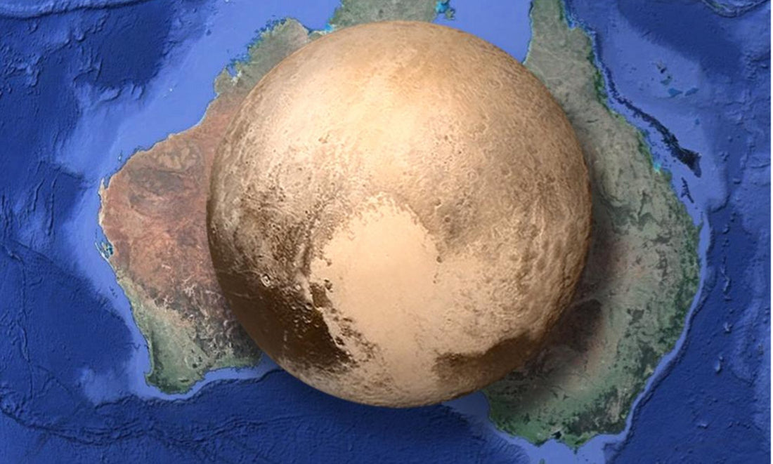
Folks in the Northern Territory might think it's like this...
But it shows the glaring inaccuracy of using a Mercator Projection for country size.
Oh and China, The U.S., and India easily fit within Africa with room for Greenland.
Check it out for yourself and let us know any striking findings in comments!
Thanks for reading and share with a friend to spread ARSE as we thrust Australia into the deep unknown...
#Space_Aus


