Presenting The Most Accurate Flat Map Ever, And It's A Double Ender.
For a long time, at least 100 years or so, we have attempted to map the pale blue dot on a 2D map. And the results have been less than stellar.
But what if we flattened the Earth? And no, we don't mean the Earth is flat.
What if it was flattened so we could see a more accurate representation of the world?
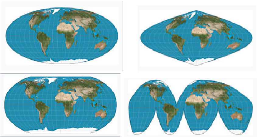
The most common 2D maps used, and the ones you probably saw at school are called Mercator maps, designed by Dutch geographer Gerard Mercator in 1596 for naval voyages. What you mightn't know is they're profoundly inaccurate, especially where the world gets further from the equator.
Why?
Because a Mercator projection shows the correct shape of countries, but at the expense of their sizes. The biggest challenge with creating an accurate map is that it is impossible to portray a sphere on a flat map – a problem that has troubled cartographers for centuries.
It's worth adding that the "Age of Discovery" was a period from the early 15th century and continuing into the early 17th century, during which European ships traveled around the world to search for new trading routes and partners to feed burgeoning capitalism in Europe.
Here is a gif from a climate data scientist from the Met Office complete with true proportions.

In reality, Africa is about 14 times larger than Greenland. Except on a Mercator map it appears the be almost equal in size. Similarly with Brazil and Alaska, the South American nation is almost five time larger, and yet Alaska dwarfs it on a 2D map. The map also suggests that Scandinavian countries are larger than India, where it is actually three times the size of all Scandinavian countries put together.
Europe looks larger than North America, but, again, the opposite is true. This has caused confusion and ongoing discourse around historical facts and events, such as World War II. In reality, Japan and Hawaii are much closer together than Mercator maps show. More locally, Australia is almost painfully close to South-East Asia, giving the efforts caused in the WWII all the more context.
The "size" of the world has been dubiously passed down from generation to the next. But no longer...
Dubbed the most accurate map ever created, it is two "pancake" representations of the northern and southern hemispheres. Unlike other maps, it neither downsizes or supersizes the proportions of land masses like Greenland vs Africa.
Another bonus is the map can be shrunk without losing quality.
"This is a map you can hold in your hand," said study lead researcher J. Richard Gott, an emeritus professor of astrophysics at Princeton University. "The map can be printed front-and-back on a single magazine page, ready for the reader to cut out."
To create the perfect map, the researchers first studied the strengths and weaknesses of maps used and rated them on a scale before publishing their findings in the journal Cartographica. Their system appraised maps on six types of distortion criteria:
- Local shapes
- Areas
- Distances
- Flexion and bending distortion from the Earth's curve
- Skewness, a form of lopsidedness
- Gaps in the map, such as the cleft between east and west
The lower the score on the index, the more accurate the map. For reference, a globe scores a zero.
"One can't make everything perfect. A map that is good at one thing may not be good at depicting other things." For instance, the Mercator projection represents local shapes well, but distorts surface area the further from the equator you look. Often times, the north and south poles are cropped because of this.
Take, for example, the world map most people are familiar with — the Mercator projection, a staple found in many classrooms and the basis for Google Maps. While the Mercator projection is good at representing local shapes, it distorts surface areas near the North and South Poles, so these regions are often chopped off, the researchers said.
According to the rating system, the Winkel Tripel was the most accurate flat map in existence. You might see this 1921 product made by German cartographer Oswald Winkel painted all over the National Geographic Society. The map scored a low 4.563, but still suffered from a cleft that cut the world vertically, with the same Japan-Hawaii issue as mentioned before.
To upgrade the Winkel Tripel projection, the researchers took a new perspective. Literally.
To create the most accurate flat map possible, Gott said "we're proposing a radically different kind of map, and we beat Winkel Tripel on each and every one of the six errors."
The Most Accurate Flat Map Ever Created

The "Pancake" map, a double ended projection shown from the poles.
It borrowed ideas from many 3D sided shapes to explore the differing perspectives of the human viewpoint. In 1943, an American architect named Richard Buckminster Fuller drew outlines of regular shapes that made up a world map that could be folded to make a rudimentary, polyhedral globe.
It wasn't accurate, but what it did do was introduce the idea of sticking regular shapes to one another and Gott ran with it, leading to the idea of a double-ended circular map.
The Pancake map can be viewed side-by-side, or back-to-front with no boundary cuts. if you want to test it out, get a piece of string and reach around from one side to the other and measure. Gott stands by his design and maintains the accuracy.
"If you're an ant, you can crawl from one side ... to the other," he said. "We have continuity over the equator. Africa and South America are draped over the edge, like a sheet over a clothesline, but they're continuous."
Additionally, The pancake map also has smaller distance errors than any other 2D flat map. For instance, its configuration means distances can't be more or less than 22.2% of what they are in reality, Gott said. In comparison, the Mercator and Winkel Tripel projections have remarkably high distance errors near the poles and at the left and right edges of the map.
areas at the pancake map's equatorial edge are only 1.57 times larger than areas at the center, the researchers said.
Gott said he's not aware of any other double-sided pancake Earth. "Our map is actually more like the globe than other flat maps," Gott said. "To see all of the globe, you have to rotate it; to see all of our new map, you simply have to flip it over."
Gott and his colleagues have also created pancake-like maps of Mars, Jupiter, the sun and other heavenly bodies.
Are you team pancake, or do you hold onto the Mercator projection?
Let us know in comments and help us spread ARSE into the deep unknown...
#Space_Aus


